iPhone Photography Workflow: Castle Pottendorf
During the lockdown, I got a few great photos of the empty city of Vienna, and once the restrictions were lifted, I went for a walk in a nearby park with a well known abandoned and partially decayed castle named Castle Pottendorf. The park (but not the castle) is publicly accessible, and you can find it here on Apple Maps.
Castle Pottendorf is a beautiful abandoned castle in Lower Austria
The castle, like almost all other castles I know, dates back to the 12th century. Its deterioration began after World War II, where it was used as a military hospital and was struck by an aerial bomb. After the end of World War II, the castle was abandoned.
After I posted this photo to my flickr account, it was selected for Flickr Explore a curated photo feed. So I thought that this photo would be an excellent fit for another iPhone workflow tutorial.
How I shot the photo of castle Pottendorf
Strolling through the castle grounds, I noticed a few trees that perfectly framed the castle and its reflection in the water.
As I wasn't walking along, I just took a quick snapshot using the iOS built-in camera app. I've to admit that I like the shutter release button on the Apple Smart Battery Case the more I use it. Convenient stuff.
How I composed the photo of castle Pottendorf
Aside from the trees that frame the castle, two more things caught my eye. First, the reflection of the castle in the water and last, the perspective of the castle. Unfortunately, it's not as symmetric as I would have liked it.
How I edited the photo
Here's how the photo looks straight out of the camera.
Castle Pottendorf out of the iPhone Camera App
But there are a few things that I didn't like and wanted to change:
- The overall photo was a bit dull and lacked depth
- The grass was a bit too green for my taste
- The decaying facade didn't stand out as well as I wanted it to
- The sky is a bit too blue
But luckily, that's easy to fix using Lightroom Mobile.
The first step was to adjust a few sliders in the light adjustments group, specifically contrast, highlights, and shadows, plus blacks and whites, but these had only a minimal effect.
Adjustments from the Lights adjustment group
If you look at the original photo, it seems a bit dull and could use a bit more depth. To add depth, I increased the contrast slider.
By dragging the highlights slider to the left, I mainly darken the blue sky a bit. We'll fix the rest of the sky a little bit later using color adjustments.
Finally, by increasing the shadows, I bring back some color in the formerly almost black leaves in the foreground and brighten the castle's facade's left side a bit.
Fix the blue sky with color adjustments in Lightroom Mobile
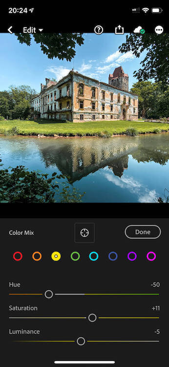
Next, I'm dealing with the colors. First, let's fix the sky by going to the color adjustments group and tap the color wheel in the upper right corner. Then I select the blue color and drag the hue and saturation sliders to the left. This fixes the saturated blue tone and adds a minimal cyan effect to the sky.
Fixing the saturation and luminance of the grass
Now for the grass. To me, it looks unnaturally green. So let's drag the green color saturation slider to the left to desaturate it a bit and reduce the luminance to darken it a bit more, so it has a nice contrast to the areas around it - especially the castle.
Adjust the tone of the facade
Then, let's deal with the facade. The color that's peeling off the facade was yellow—surrounded by white. Not the best contrast. As I'm still in the color adjustment, I drag the yellow color to the left towards the reds and slightly increase the saturation. This adds a reddish touch to the facade and thus a better contrast so that you can see that the color of the facade is peeling off.
Use selective adjustments to adjust objects
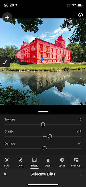
To make the decaying facade even more visible, I used selective adjustments. After painting the entire castle to create a selective adjustment, I brought down the selection highlights even further and added a bit of clarity.
Finally, I adjusted the overall clarity a bit.
That's it, and here's the final edit that made it to Flick Explore.
Castle Pottendorf shot on iPhone 11 Pro
As Lightroom Mobile now allows you to share edits, you can replay the edits of this photo directly in Lightroom Mobile.
If you liked this post, check all the other iPhone photography workflow tutorials I wrote. And if you're still curious, see all the recommended iPhone photo apps and iPhone photo gear) I use regularly.
Care about some quick feedback about this article?


